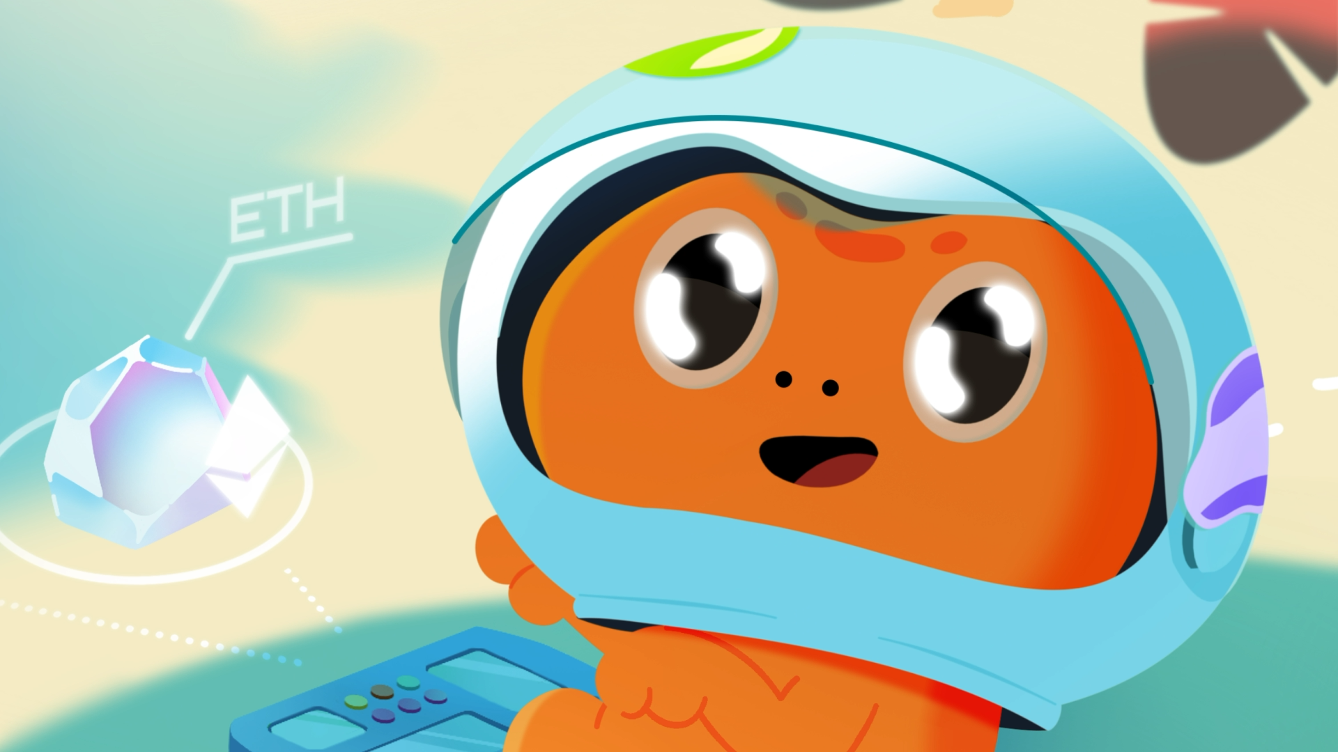
The animation studio SHOTS reached out to us with a proposal for collaboration on creating a series of animated promotional videos for the Headway app for the Canadian market.
And what did we do?
Of course, we agreed and didn't even blink when the deadlines were announced: 3 weeks instead of expected 7 for such a project.
And we made it. Let's start from the beginning 🙂


PROBLEM
In short, the Headway app extracts the most interesting thoughts from popular self-development, business, and psychology books and offers them to users in text and audio formats. 15 minutes a day, and you'll improve your financial literacy, partnerships, or cope with anxiety through practical advice. We were super excited to work with a top Ukrainian product [already in 140 countries and 7 million downloads 😎].
The key challenge for Headway was to bring users back to the app: often, it was downloaded but not used, or users visited it less and less frequently. Why? Because they were watching series on Netflix, scrolling through Tik-Tok, or chatting with friends and colleagues about everything in the world... In a word, PROCRASTINATING.
This is what the SHOTS agency built its advertising campaign on: a cool, catchy main character Procrastination featured in 5 funny "lazy" videos will remind users that "instead of procrastinating, you can spend 15 minutes productively, for example: improve your relationships, learn something useful, generate new ideas" and more.
PRODUCTION
Our main task was to develop a character and create funny videos where everyone can recognize themselves.
Stage 1. Creating the character
"We liked the agency's idea, but it seemed that the character didn't quite fit the client's style and stood out a bit. So we proposed a few of our own characters that we thought were more adapted."
Olya, illustrator
We proposed 4 versions of our main character, Procrastination. We took the colors from Headway's brand book, which is the foundation of the app. Many of them are pastel, calming the mind and allowing you to focus on information, but there were also a few accent and bright colors that we decided to use to attract attention.
.png)
As a result, "Mister Bum" [but shh, that's what we called him among ourselves] is more memorable, more complex, detailed, and at the same time, as lively as possible.
"The hardest part was working with the character. He was animated frame-by-frame, just like the cat that appeared in the Headway videos."
team lead Vitaliy Nebelskyi

Stage 2. Animation
First, we made animatics: we combined rough animations with voiceover and music. At this stage, it's important to show how the character will move, how it will blend with the voiceover and music, and how the message will be conveyed. When approved, we drew everything cleanly in color.

We animated the characters frame-by-frame, and secondary objects and backgrounds with motion animation.

Since the video ad with Mister Bum was planned to be launched on different platforms, we adapted the video to several required formats:
- vertical
- square
- short versions
In total, we created 15 promotional animations.


.png)

.png)


.png)


