.png)
MacPaw is a top software development company from Ukraine that helps Mac users improve their digital experience. The company is a master at blending user-friendly design with powerful functionality for freeing up space and protecting privacy. But most importantly, they have two cats living in the main office.
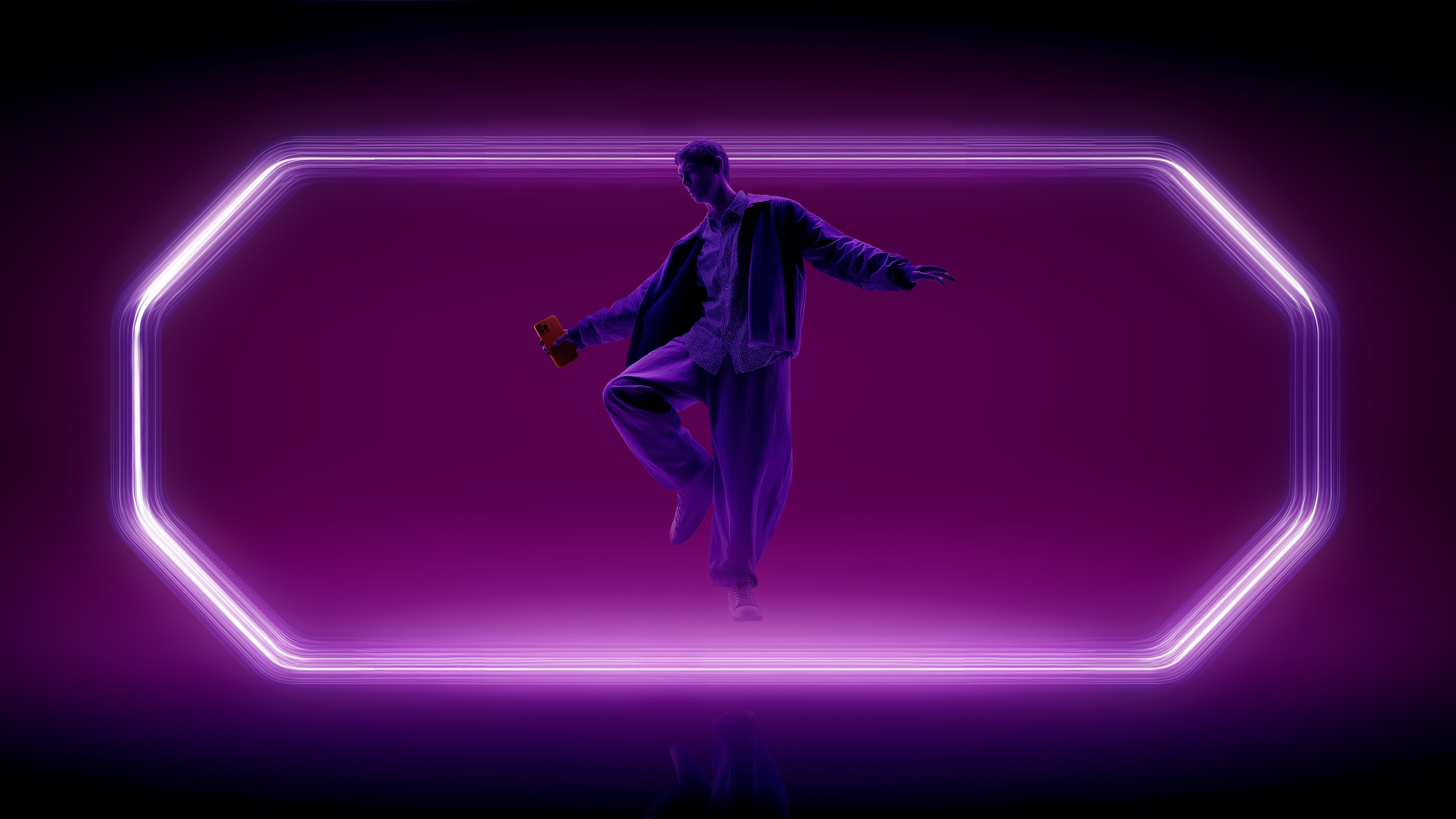
CleanMyMac, which declutters Macs and boosts performance, is the MacPaw’s flagship app. Over 30 million people are using the sleek, intuitive, and powerful app worldwide—literally, even in Antarctica. And we were excited to create a 3D animation to showcase CleanMyMac’s newest version.
PROBLEM
MacPaw had just rolled out a new version of the CleanMyMac app—we’re talking a brand-new interface, exciting new features, and a complete overhaul that’s been in the works for a long time.
This wasn’t just any update; it was a serious glow-up that needed to be shared in a way that felt fresh, stylish, and engaging. With five key modules in the app, each one had to shine. And along with the main English version, five localized versions had to be made in Italian, Spanish, German, French, and Japanese.
The MacPaw team had an inspiring concept in mind: a peek into the “inner world” of the computer to show how the app works from the inside out. We went with this idea and took it up a notch (or two). The and action team reimagined, refined, and revamped it, giving the CleanMyMac promo the personality it deserved.
SOLUTION
Sticking with the concept, we decided to ditch the typical computer-world visuals and steer clear of any dark, Matrix-like spaces. We wanted to reimagine this universe in a way that felt fresh but still true to the app’s vibe.
After exploring MacPaw’s messaging, we latched onto the phrase “Welcome to your digital oasis.” That sparked our vision: a vibrant digital oasis filled with fantastic micro-universes, each representing a unique tool in the CleanMyMac app. This style was the one we and the client both knew would bring the animation to life.
PRODUCTION
To create the universe of our digital oasis, we built five distinct micro-universes for each tool: Cleanup, Protection, Performance, Application, and MyClutter. The color scheme and vibe of each setting were inspired by the icons and functions of these tools.
We started with classic 2D illustrations and storyboards to create the initial animatic. From there, we moved into blocking out the animation, which we later rendered into its final 3D form.

The real challenge was coming up with original associations and metaphors to capture the functionality of each CleanMyMac tool.
For example, to show how the app handles duplicate files, we created a space with mirrors that reflect—that is, duplicate—files. Then, MyClutter steps in, scattering these mirrors and clearing the space.
For the Performance tool, we designed a centrifuge that only kicks in once all unnecessary elements are removed. The result? Unique visual metaphors for each micro-universe that you can’t help but get pulled into.
.png)
The project was brought to life by the animation team at the and action agency.


.png)

.png)


.png)
.png)

